E-commerce Category Pages: Design Strategies That Boost Engagement and Conversion
You spend countless hours perfecting product pages – scrutinizing every pixel to craft visually compelling designs that drive sales. But what about those often-overlooked category pages?
They’re the unsung heroes of ecommerce, guiding customers through your digital store. Don’t treat them as afterthoughts. Optimized category pages keep visitors engaged and primed to convert.
In this guide, we’ll walk through proven strategies for designing ecommerce category pages that spark curiosity and sales. You’ll learn techniques for maintaining your brand’s visual identity while removing friction from the shopping experience.
Whether you’re a UI designer, digital marketer, or retail entrepreneur, you’ll walk away with an arsenal of ecommerce tactics to elevate those category pages from bland, uninspiring spaces to customer-delighting product showcases.
Chapters
Enable Multiple Product Views

One of the biggest challenges shoppers face on category pages is quickly evaluating which products best fit their needs.
Providing multiple views of each item allows customers to inspect details from various angles before diving deeper. This helps in keeping them engaged in your product collection.
When done well, this tactic shortens the consideration cycle and reduces bounce rates. Shoppers can compare products side-by-side without opening every individual listing. It enables more informed purchase decisions from the category level.
Here’s how to entertain your prospects with multiple product views:
- Balance simplicity and interactivity. Don’t overwhelm your customers with too many viewing options that could distract or confuse them.
- Stick to 2-4 views at maximum – one default image plus additional revealing angles on hover or click.
- Use views to showcase the product from different perspectives, materials, or use cases.
- Implement smooth transitions between views, like slick image swaps or spins on hover.
- You could also try lightbox gallery popups, video reels, or 3D model rotations for a premium, immersive feel. Just ensure consistency in your UI patterns across all product views.
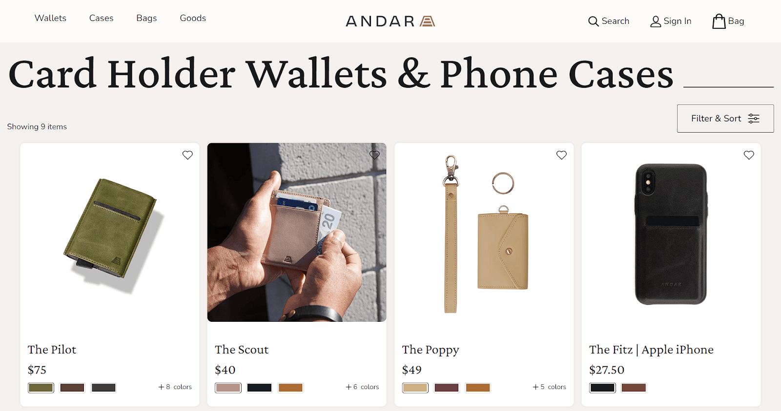
Andar, a brand known for its leather wallets, bags, and cases, successfully employs this strategy on their category page for card holder wallets.
On hover, each product tile triggers a slick transition to show the item being used in a real-life context – like pulling a card from the wallet’s inner slots.
Source: andar.com
These contextual angles better convey the wallet’s functionality and craftsmanship, aiding product comparison right on the category page.
Shorten the Conversion Process
In a world of endless choices and limited attention spans, reducing friction is key. The longer the path to purchase, the more chances shoppers will abandon their cart.
Streamlining this flow by allowing category page add-to-carts capitalizes on impulse buys and shortens the conversion funnel.
This tactic removes unnecessary clicks between product discovery and checkout initiation. It meets customers where their purchase intent is highest – when they’re actively browsing and comparing your products. Don’t let that interest wane by forcing extra steps before adding to cart.
Here’s how to maximize the conversion potential of your category pages:
- Focus on clear calls-to-action (CTAs) and unobtrusive add-to-cart buttons/popups on each product tile.
- Ensure these elements harmonize with your overall category page design instead of appearing tacked-on. You can go as simple as “+ Add” text links or more obvious buttons with cart icons.
- Advanced approaches include quick-view popups with rich product details, swatches, and size/quantity selectors – all without leaving the category flow. Or try dynamic in-context windows that suggest similar products live as shoppers browse.
Whatever path you choose, always display inventory notifications like “Only 3 left!” to spark scarcity-driven purchases. And eliminate conversion obstacles by emphasizing free shipping/returns.
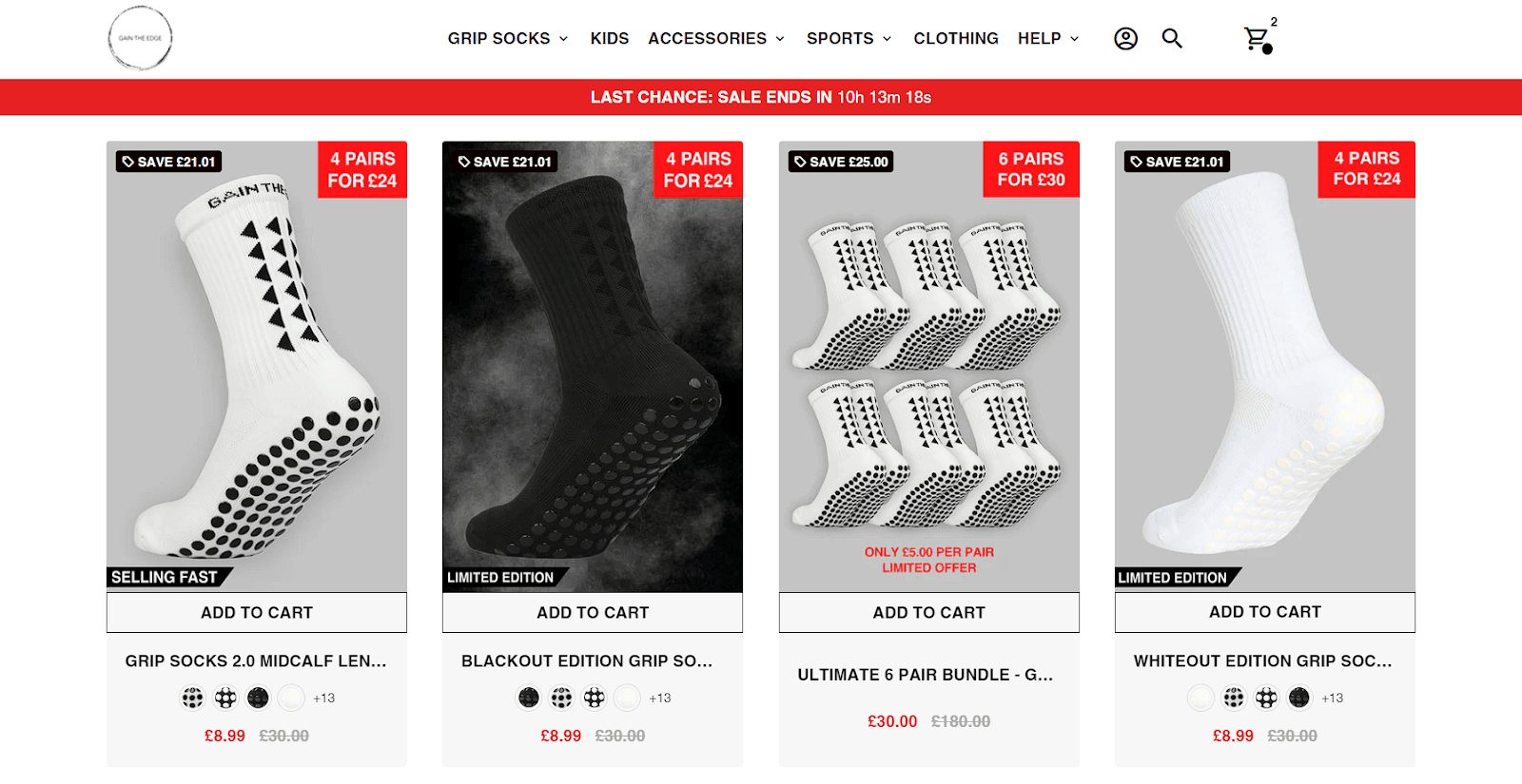
Gain The Edge Official, a brand specializing in grip socks, effectively utilizes this strategy on their category page for mid-calf grip socks.
Each product tile on this page has an obvious “Add to Cart” button accompanying the imagery, description, and price of the product.
Source: gaintheedgeofficial.com
This micro-conversion simplifies the buying process by skipping ahead several clicks for impulse purchases.
Avoid “Out of Stock” Disappointment
There’s nothing more frustrating than finding the perfect product, only to be blocked by an “out of stock” notice at the last second.
This anticlimactic letdown often leads to abandoned carts and shopping exits. Avoid this pitfall by proactively communicating stock levels on your category pages.
This level of transparency sets proper expectations early and eliminates surprises later in the buying process. Shoppers can easily see what’s available now or plan for restocked items without wasted effort. It builds trust by respecting visitors’ time through clear inventory communication.
Here’s how to keep shoppers aware of your product availability:
- Visually distinguish items with full availability from partially or fully out-of-stock products. You could gray out or overlay sold-out images or use colored availability dots/ribbons. For products with partial inventory, like size/color variations, show these options directly in the category listing.
- Consider allowing visibility into accurate stock counts, too. Stating that you only have a few left creates urgency.
- Offer stock alerts so customers can be notified when items are back in stock.
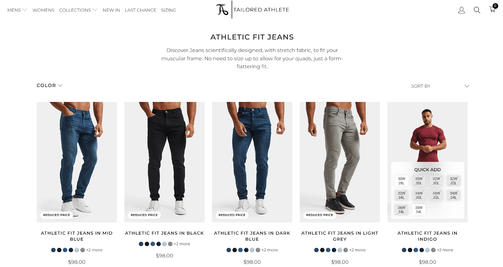
Tailored Athlete, a brand known for its athletic fit menswear, successfully implements this strategy on their category page for athletic fit jeans.
As you hover over each product, the available sizes neatly appear inline, highlighting which options are currently sold out.
Source: tailoredathlete.com
This proactive transparency avoids frustration and reduces drop-off before checkout.
By adopting similar practices, you can avoid disappointing your customers and keep them coming back for more.
Sneak in Some Social Proof
In the era of rampant online skepticism, social proof carries serious weight. A whopping 72% of consumers won’t make any purchasing decisions until they’ve read reviews. Neglecting to showcase this crucial social validation on category pages is a missed opportunity.
Sprinkling in ratings, review snippets, and counters hits buyers with trusted peer endorsements right when they’re considering buying your products. This subtle psychological nudge instills confidence and positions your brand as a reputable choice worthy of further exploration.
Here’s how to integrate social proof on your category pages:
- Stick to clean, easy-to-scan displays that don’t overwhelm product visuals. A simple star rating or thumbs up/down symbol conveys quality at a glance.
- You can also try compact review quote excerpts that customers can expand if desired.
- Prominently displaying aggregate review counts and averages is a must too. Numbers like “4.8/5 based on 576 reviews” pack credibility. This transparency breeds trust that reviews aren’t cherry-picked.
- For products with huge review datasets, extract key positives/negatives into visual tags like “lightweight, durable” or “small grips.” You’re summarizing reams of feedback into scannable nuggets.
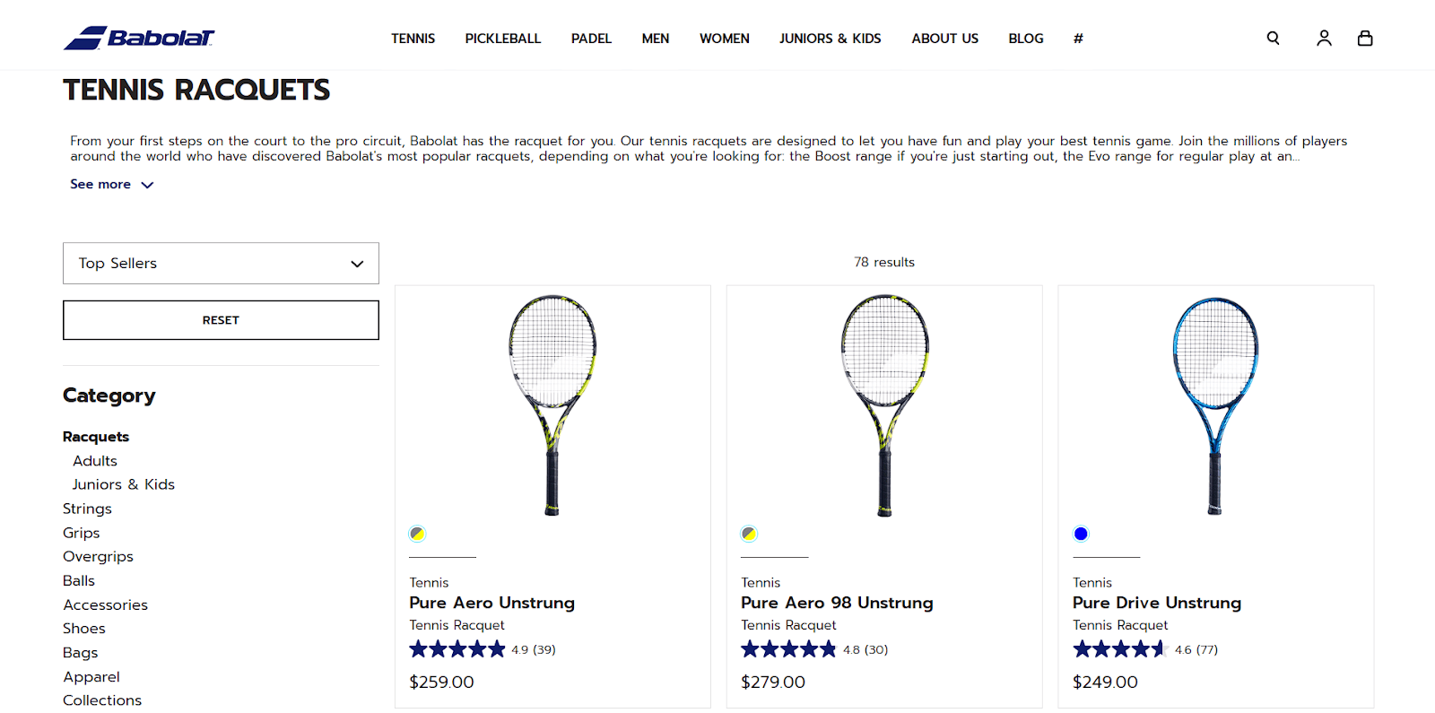
Babolat, a renowned tennis apparel and equipment brand, successfully uses this strategy on its category page for tennis racquets.
Every product tile features a star rating and the number of reviews that customers can read on each product page.
Source: babolat.com
These omnipresent proof points undoubtedly increase the confidence to purchase across the company’s product lineup.
Offer Advanced Filtering Options
With endless products spanning numerous categories, filters are a shopper’s best friend for quickly narrowing options.
But basic size and color filters don’t cut it anymore. Providing advanced filtering capabilities tailored to your products allows customers to laser-focus their search criteria.
This level of control empowers shoppers to find exactly what they want without sifting through irrelevant results. It transforms overwhelming product catalogs into curated collections matched to each visitor’s unique needs and preferences. The more parameters you support, the more personalized the experience.
Here’s how to help shoppers narrow down their product search:
- Start with essential product specs like size, color, price range, and material.
- But dig deeper into technical details, special features, or niche use cases. Let customers filter by certifications, compatibility, technique, or any other ultra-specific attribute important to your audience.
- Organize filters intuitively in a sidebar or drawer with collapsible sections for subgroups.
- Display real-time option counts and implement smart logic – only surface applicable filters based on current refinements.
- Make heavy use of visuals over text where possible as well.
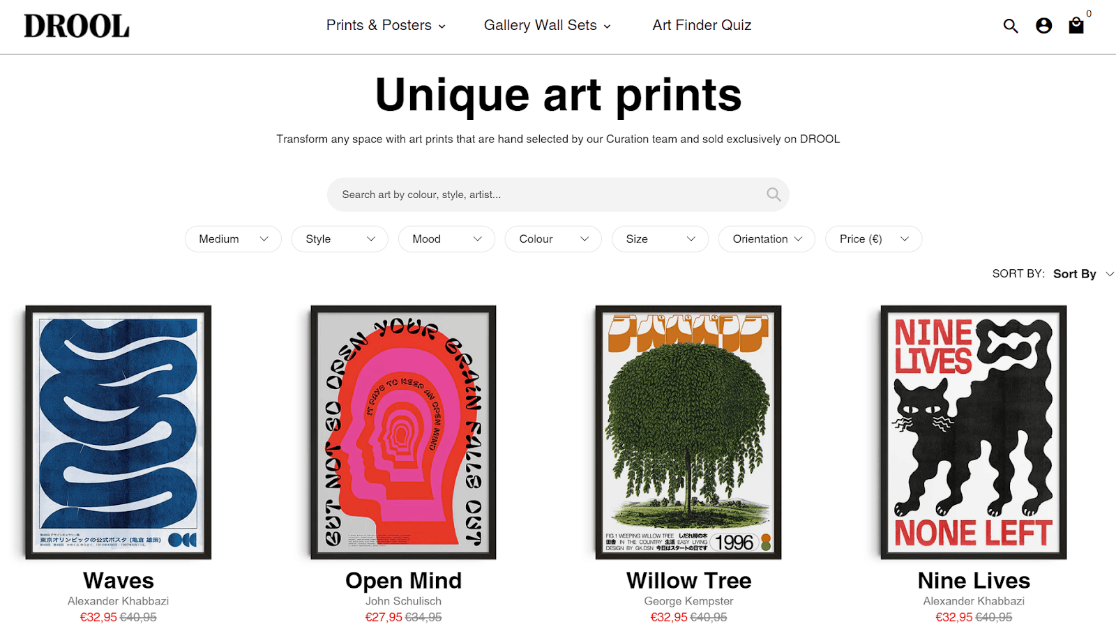
For an advanced masterclass of this strategy, look at Drool’s category page for unique art prints.
This brand specializing in art posters and prints incorporates a multi-level filter drawer. From there, shoppers can choose from options like art medium, print size, style, mood, color, and orientation, and select a price range.
Source: drool-art.com
This granular customization allows finding the perfect wall art while dismissing hundreds of unwanted options with a couple of clicks.
Optimize for Mobile Shopping
With around 77% of all traffic on retail sites now coming from mobile devices, delivering a seamless small-screen experience is non-negotiable.
Clunky category pages that require excessive pinching and scrolling are a surefire way to lose impatient, on-the-go shoppers.
Prioritizing mobile optimization drives engagement, reduces bounce rates, and caters to modern consumer behavior. People expect fast-loading product browsing from wherever they are. If your ecommerce experience doesn’t render smoothly on smartphones and tablets, you’re leaving easy money on the table.
Here’s how to optimize your product pages for any device:
- Start by prioritizing speed optimizations like compressed images, lean code, and accelerated mobile pages.
- Then, focus on streamlining category page layouts for confined viewports. Stick to single-column grids, limit product tiles per row, and ditch sidebars that disrupt vertical scrolling.
- Ensure effortless filtering via intuitive accordions or slide-out menus.
- Make CTAs like “Add to Cart” big and thumb-friendly.
- Also, rethink text hierarchy – ruthlessly prune non-essential details that clutter up the small screen. Think bolder headings and succinct product blurbs.
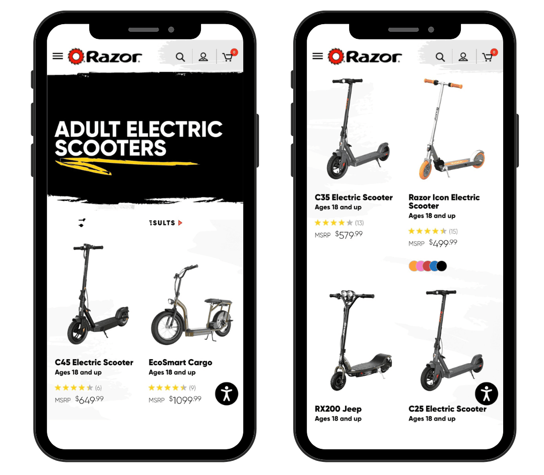
Razor, a brand known for its scooters and electric rides, successfully implements this strategy on its mobile category pages.
Product tiles are large and thumb-accessible, with only two per row to maximize visibility on smaller devices. Filtering options tuck neatly into a slide-out menu, while textual and social proof elements are legible and proportional.
Source: razor.com
By optimizing your ecommerce category pages for mobile, you can provide a superior shopping experience that captures the growing mobile audience and drives more sales.
Final Thoughts
With the strategies covered here, you’re armed with a full arsenal for crafting ecommerce category pages that deeply engage shoppers and propel more sales.
Don’t let these pivotal entry points fall by the wayside. Put these lessons into practice and turn your category pages from bland, friction-filled spaces into compelling product showcases that educate customers and expedite conversions.
Create more and better content
Check out the following resources and Grow!