10 Email Newsletter Design Ideas to Hook Your Subscribers
Are you looking to improve your Email Marketing Campaigns? Be sure to pay attention to your Email Design. Check out our tips.
The email newsletter strategy is still going strong today. As every internet user uses email on any occasion, you have a higher chance of reaching out to a broader audience.
Although other online campaigns overshadow email marketing tactics, a surprising survey finds that 62% of Millennials still prefer this marketing promotion over other things. They agree that using email feels more personal while also gives a sense of professionalism. Check out design trends for email newsletters and improve your campaigns.
Moreover, having email newsletters in your marketing campaign is great for capturing attention. Email newsletters are 40x more effective for acquiring customers compared to other social media marketing strategies using LinkedIn and Twitter.
So, don’t fret just yet if you haven’t got a fruitful result from your email newsletter campaigns. The problem may not be the tactic itself but how you optimize it to achieve your goal. Your past email newsletter may be too boring for your audience, or you can’t address the message clearly.
Here are some email newsletter design tips to help you craft engaging yet meaningful content for your audience.
1. Straightforward offer
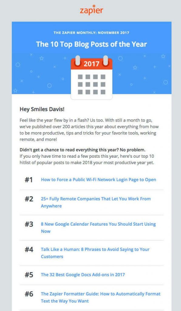
The first idea is to make a quick and straightforward offer on your email content. While it may sound a bit hard-selling, it’s not. This is one of the types to get the word straight to the point and not just beat around the bush.
The thing about receiving email is that not everyone has the time for it. Many would just open the email and skim through the message without actually paying attention to it.
Make sure that you have your content all set, which means it should be the main point why recipients should read your message. Use big fonts and bold colors if necessary to capture their attention from the get-go.
2. Video integration
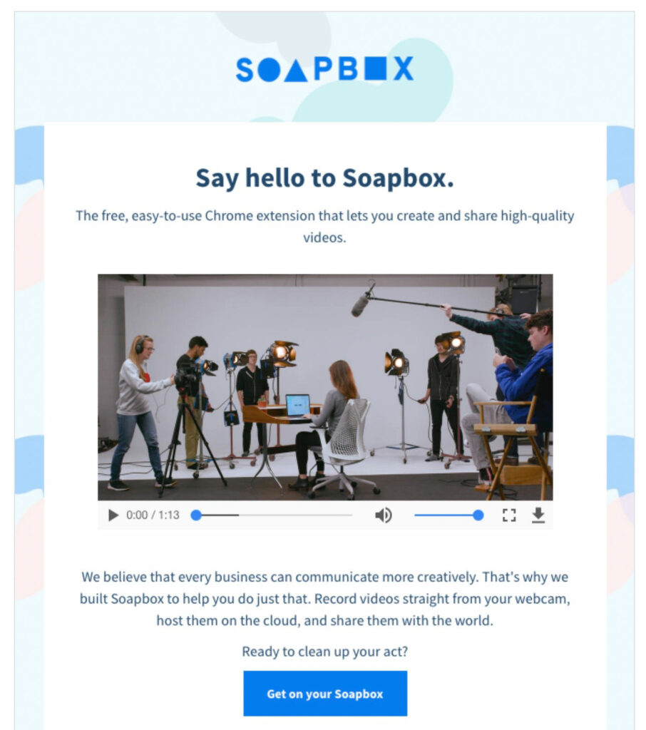
Although embedding videos isn’t doable at the moment, you can always put a snippet about your video content in the newsletter. Videos are engaging online content that accounts for 82% of internet traffic in 2021.
Having videos integrated as a snippet image with a link will take your newsletter to the next level. Recipients will be more intrigued to check out your videos to learn about your promotion.
Rather than reading a long, bulky email text, people will love to watch videos instead. Hence, including a link to your product demo videos will make your email marketing even more engaging.
3. Attractive colors
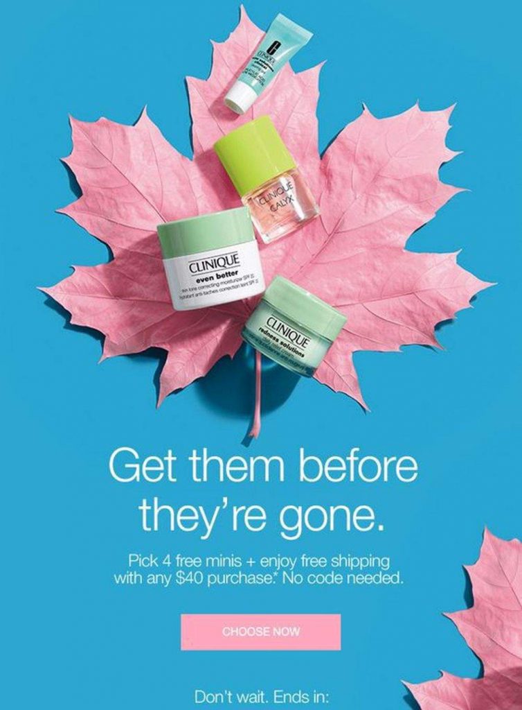
Color theory is one of the essential elements of designing. Understanding which colors evoke emotions and bring out personality can help you deliver your actual message to your audience.
Colors are the representation of your brand and your messages. The type of color you use to convey a specific message can mean different things to the recipient.
Try using colors that match your profile or your message the moment you send it to the audience. Bright colors usually accentuate the important yet exciting thing that people should notice. This is why many businesses opt to use vivid colors to represent their new promotional items. They might even use a background remover tool to drive all the attention to that specific item.
4. Product features
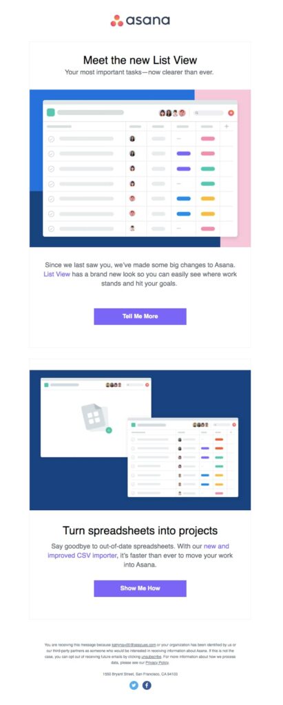
Let’s say you have a new product to be offered early on the market. Sending out an email newsletter is a great strategy to hook your target audience to pay attention closely to your items. It’s an adequate time to acquire customers because they get the offer first.
So, the next thing you do is to put product features right in the first place. This way, you’ll be making a lasting impression on the readers.
You can also add product reviews made by other people as an additional reason for your subscribers to give them a try. Nothing builds your credibility like having someone who experienced using your products and services share how it feels to have been satisfied by you. Don’t forget testimonials from happy customers in your email newsletter designs.
5. Seasonal design
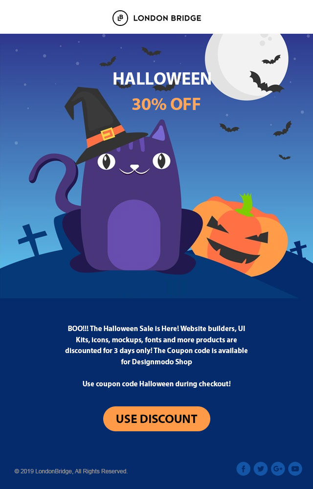
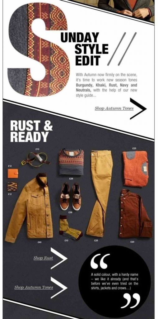
This is an exciting part of designing your email newsletter. Having designs that fit the current event will never go wrong. In fact, it’s one of the engaging strategies to capture your recipient’s attention.
When it’s Halloween, you can design the Jack-o’-lantern theme and make a special offer as well. Or, use Snowman-esque themes to promote your Winter apparel. Make sure to go all out by inducing the theme fonts to improve your newsletter visual.
6. Simplicity is key
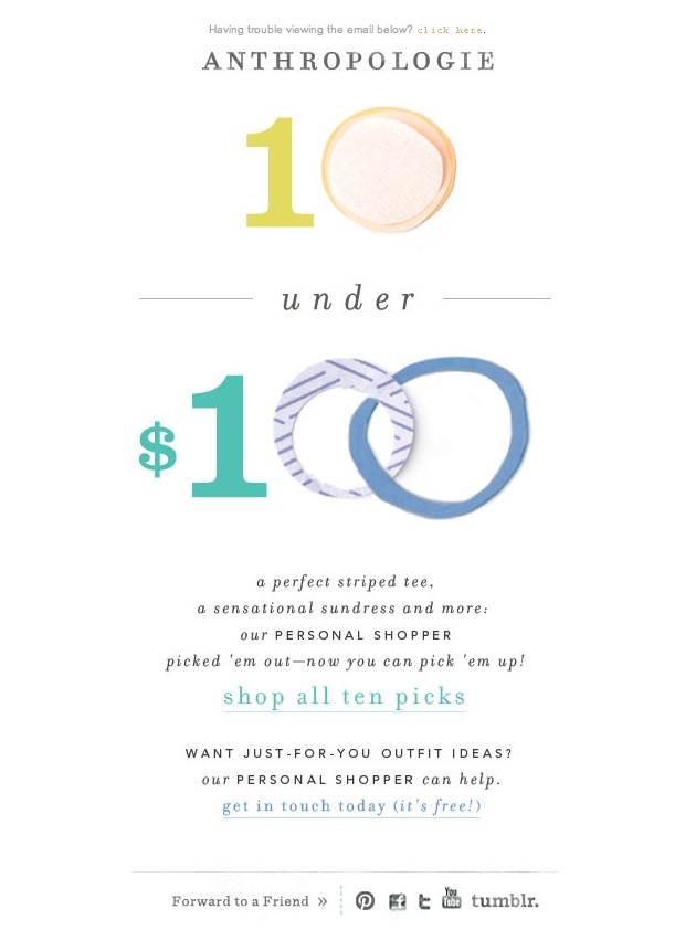
Again, you can put every color or intriguing theme on your newsletter still nothing can beat the power of simplicity. This is another design idea you should take into account. While most ideas will focus on themes and major elements like including images or GIFs, this idea will work best for conveying meaningful messages.
Put a simple background to accentuate your business profile. The white background color is great for delivering a quick and informative message without making it too cluttered.
You can use blocks and a few lines to ensure its presentation. These elements will make your newsletter neat while also giving a sense of authority.
Just like using a plain background, putting something simple like a quote can work in terms of providing an effective message without making it too cluttered or complicated at first glance.
7. Storytelling

Storytelling is the heart of every marketing and should never be left out of email newsletter campaigns. Use storytelling to deliver your brand or product’s story to catch your audience’s heart. Many would love reading a storytelling-type of content rather than having a plain article about your business.
However, make sure to make your storytelling short and to the point. Remember that storytelling is one of those elements that could make or break your email campaign. Make sure that you have your story-building content, not a long-winded recounting or tale about how you started out in business.
8. Characterization or animation
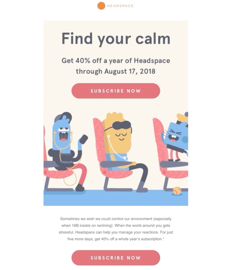
Animation is fun and exciting. It engages with the audience better than a simple text on your newsletter. With animation, you can address your messages much more seamlessly as it helps you break them down into a chunk, biteable piece. You can also add a bit of fun to your newsletter.
Having animation in your newsletter will make it easier for recipients to notice your message quickly. Use a storyboard style of animation when promoting your
9. The call to action
Call to action is an important element in every marketing strategy. You can use this design when you want your audience to connect with your product shortly. The call to action button will entice recipients to click rather quickly when noticing it.
If you have a product to promote or you’re currently running a special offer, the call to action design will help you acquire more customers. Let’s imagine a situation like this, when people are presented with a long-block text, colorful call to action buttons will attract them at the very first glance. Hence, allowing them to click on the button to fill out their curiosity.
10. Compelling content

The quality of content is essential if you want to hook or build trust with others, especially when they receive something from you, including advertisements via email newsletter. If the words are relevant, easily understood, and read, then it makes sense why so many people prefer reading emails coming directly from businesses rather than those coming from unknown sources.
The use of big fonts and short headlines will grab the reader’s attention, while white space between graphics and text helps in breaking up content into smaller pieces.
Takeaway
Attention spans are short, and there is a lot of content out there. It’s difficult for marketers to keep up with the constant changes in technology, so they need an edge to help them deliver their message effectively.
However, there are many ways to design a newsletter to catch your subscribers’ attention and keep them reading. The key is knowing what works best for you, your business goals, and the audience of your emails. We hope these ten email newsletter ideas help guide you in creating an engaging experience with every message!
Author
 Andre Oentoro is the founder of Breadnbeyond, an award-winning explainer video company. He helps businesses increase conversion rates, close more sales, and get positive ROI from explainer videos (in that order).
Twitter: @breadnbeyond
Email: andre@breadnbeyond.com
FAQ
What are the key elements of effective email newsletter design?
Effective email newsletter design includes a clean layout, a balance of text and visuals, brand-consistent colors and fonts, clear headings, and a mobile-friendly format.
How important is the choice of color in email newsletter design?
Color choice is crucial as it influences readability and brand recognition. Use colors that reflect your brand identity and ensure good contrast between background and text for readability.
What role do typography and font choice play in newsletter design?
Typography and font choice significantly impact legibility and the tone of the newsletter. Use easy-to-read fonts for body text and more distinctive fonts for headings, keeping brand consistency in mind.
How can visuals be effectively incorporated in email newsletters?
Incorporate visuals like images, infographics, and videos to break up text, illustrate points, and engage readers. Ensure they are high-quality, relevant, and complement the content of the newsletter.
What are some best practices for layout and structure in newsletter design?
Best practices include a clean and consistent layout, logical content flow, use of white space to avoid clutter, clear section divisions, and a prominent call-to-action.
How can I ensure my email newsletter is mobile-friendly?
To ensure mobile-friendliness, use a responsive design that adjusts to screen size, opt for a single-column layout, use large, clickable buttons, and ensure text and images are viewable without zooming.
What’s the significance of a header and footer in email newsletter design?
A header typically includes your logo and sets the tone, while the footer provides contact information, legal disclaimers, and unsubscribe links, contributing to a professional and functional design.
How do I balance content and design in an email newsletter?
Balance content and design by ensuring the design complements and enhances the message, using visuals strategically, and avoiding excessive design elements that might overshadow the content.
What are some effective ways to use calls-to-action in email newsletters?
Effective calls-to-action in newsletters are visually distinct, use action-oriented language, and are placed strategically to guide readers towards desired actions like subscribing, donating, or reading more.
How can I test and optimize my email newsletter design?
Test and optimize your design by using A/B testing for different elements, gathering feedback from subscribers, and regularly reviewing analytics to see what designs and layouts perform best.
How can consistency in design enhance the effectiveness of email newsletters?
Consistency in design elements like colors, fonts, and layout enhances brand recognition and creates a familiar experience for readers, making your newsletters more professional and trustworthy.
What is the role of white space in email newsletter design?
White space, or negative space, plays a crucial role in design by making the content more readable, helping to focus attention on important elements, and creating a clean, uncluttered aesthetic.
How can personalization be incorporated into email newsletter design?
Personalization can be incorporated by using dynamic content that changes based on subscriber data, such as using the recipient’s name in the greeting or tailoring content to their interests.
What are the best practices for using images in email newsletters?
Use high-quality, relevant images, ensure they are optimized for fast loading, provide alt text for accessibility, and avoid relying solely on images to convey critical information as some users may have images disabled.
How important is the email subject line in the overall newsletter design strategy?
The email subject line is crucial as it’s the first element readers see. A compelling subject line can significantly increase open rates and should be aligned with the newsletter’s design and content theme.
What are some common mistakes to avoid in email newsletter design?
Common mistakes include cluttered layouts, inconsistent branding, overuse of different fonts and colors, ignoring mobile optimization, and not having a clear call-to-action.
How can the use of columns affect email newsletter design?
The use of columns can organize content effectively but should be balanced with mobile responsiveness. Single-column layouts are generally preferred for mobile-friendly designs.
What are some tips for designing an accessible email newsletter?
Design for accessibility by using alt text for images, ensuring high contrast between text and background, using a readable font size, and providing a plain text version of the newsletter.
Can animation or interactive elements be used in email newsletters?
Animations like GIFs can be used to attract attention but should be used sparingly to avoid distractions. Interactive elements depend on email client capabilities and are best used when they enhance the message.
How does the footer contribute to the overall effectiveness of an email newsletter?
The footer contributes to effectiveness by providing essential information like contact details, links to social media, and the unsubscribe option, which are important for transparency and compliance with email regulations.
What is the impact of using a pre-designed template for email newsletters?
Using a pre-designed template can save time and ensure consistency in design. It allows for a professional look and feel while maintaining brand identity across different issues of the newsletter.
How can a balance between text and images be achieved in email newsletters?
Achieve a balance by ensuring that images complement the text rather than dominate it. Use images to break up long sections of text and to visually illustrate points made in the text.
What strategies can be employed to make email newsletters more interactive?
To make newsletters more interactive, include clickable elements like buttons for calls-to-action, links to further reading or resources, interactive polls, or surveys within the email.
How can color psychology be used in designing email newsletters?
Use color psychology by choosing colors that evoke the desired emotional response. For instance, blue can convey trust and dependability, while green is often associated with growth and calm.
What role do fonts play in the readability of email newsletters?
Fonts play a significant role in readability. Choose fonts that are easy to read on digital screens, and use different font sizes and styles (like bold or italics) to highlight important information.
How can branding be effectively incorporated into email newsletter design?
Incorporate branding by using your organization’s color scheme, logo, and other brand elements consistently throughout the newsletter. This reinforces brand identity and enhances recognition.
What are some techniques to ensure email newsletters load quickly?
To ensure quick loading, optimize image sizes, minimize the use of heavy graphics or videos, and use well-coded HTML. Fast-loading newsletters are crucial for keeping the audience engaged.
How can the subject matter influence the design of an email newsletter?
The subject matter should guide the design choices, like color, imagery, and layout. For example, a professional business newsletter might have a more conservative design compared to a creative arts newsletter.
What are some effective ways to segment email newsletter content?
Segment content using headings, subheadings, bullet points, or different colored or styled boxes to distinguish between different types of content, making the newsletter easier to scan and read.
How does the integration of social media links benefit email newsletter design?
Integrating social media links encourages readers to engage with your brand on other platforms, increases your reach, and offers an additional way for readers to connect and interact with your content.
Create more and better content
Check out the following resources and Grow!


